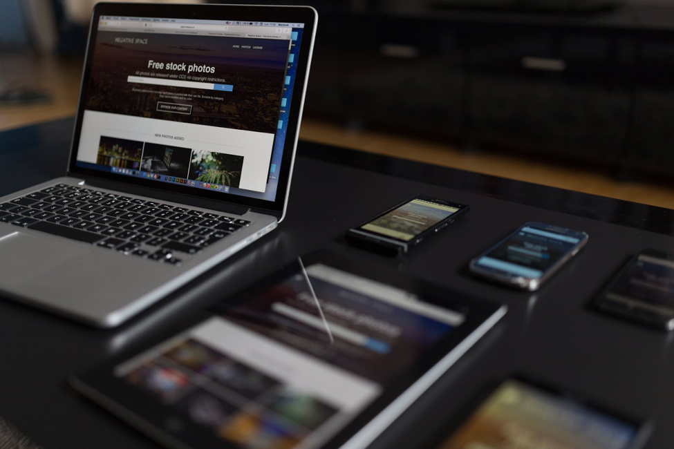
Developing websites for mobile use has become one of the best practices in web development. It has become vital as around more than 58% of site visits come from mobile visits. In fact, mobile devices are even becoming more popular than desktops in developing countries. Hence, it is no surprise that many web developers initially design their sites with mobile-friendliness in mind. After all, it provides many benefits to your site. For instance, it manages to not just make your site pleasing to look at in a small screen, but also makes it easier to read and explore. Additionally, you will also augment your traffic and conversions, while improving loading speed and customer experience. All in all, I have written this article to help you leverage the benefits of mobile-friendliness, by highlighting the key factors to consider when developing a website for mobile devices.
Responsive Design

The key aspect of mobile-friendliness is to include responsive design. As we have mentioned in previous articles, this means that the layout and display of your website can alter depending on the size of the screen. For example, adjusting the display depending on whether the page is being opened on an iPhone X or an iPhone 6. This ultimately makes it accessible to all sorts of traffic. Additionally, this adjustment improves your Search Engine Optimization (SEO) score since the site will be able to adjust to the preferred format no matter what it is. One last thing that also relates to responsive design is to also include a desktop view on your site. This is because some may still like to view the websites as if it was from a desktop. After all, a responsive design’s goal is to make your website display in a way that best suits your visitors.
Don’t Over Saturate Your Site

When designing sites for mobiles, one main issue is that you have a very limited screen to show your data. Of course, as a company, you want to display as much information about yourself so visitors learn more about your brand. However, there comes a point where too much information may increase your bounce rate. The abundance of information might make it harder for visitors to navigate through your site, and understand what you have to offer. Users want to easily process your website and understand what you can do for them. For that reason, you should display information on your site in a way that prioritizes your content based on your desired SEO key terms. For example, Jonajo focuses on software development, so our website prioritizes content related to software development.
Make Information Accessible

Making information accessible is one of the traps that can lead to saturating your site with data. However, there are many other ways of making your information easy to find. One of the main recommendations is to use larger buttons. This is especially important since the limited screen makes it hard for you to press on things sometimes . For instance, have you entered an outdated website on your phone and struggled to click on something because it was not large enough? Lack of accessibility ultimately affects the user’s experience, and can increase your bounce rate exponentially. Another logical suggestion is to also use larger and easier-to-read fonts. One example of an easy to read font is “Georgia”. All this makes it easier for visitors to read and navigate your site, making your information more attainable.
Compress Images

At last, one of the factors that many forget, is to compress the images. This is when you remove or combine parts of the image to make your images smaller. By compressing your images, it makes your site load faster, improving SEO score and the customer experience in the process. Since mobile devices use a smaller screen, you don’t need as high of resolution since a visitor would ultimately not be able to tell the difference. One thing to note is that you should always save your original image. You can always shrink an image, but you cannot expand it. When compressing the image, you can compress it as much as you like to increase the site’s loading speed. However, you should be looking for a balance between the pixel size of the image and its quality. There are many third-party sites that help you compress and optimize images, such as Optimizilla.
Knowing these factors should definitely help you solidify a great mobile usage from your customers. Of course, there are many other factors and strategies, but when it comes to the basics, these should be your first concerns. I hope this article has helped you reassess your website’s mobile-friendliness, and understand what you need to do to augment your mobile engagement.


